Color in the Garden – without the plants

Jim Sudal Ceramic DesignYou can always tell when people are sick and tired of winter when flashy accessories start popping up throughout the garden!

This past week, while visiting Sunset Magazine’s test gardens and those of the San Francisco Garden Show, I was struck by the amount of vibrant colors everywhere.

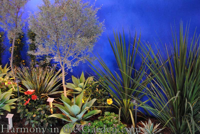
And also, interestingly enough, how the color didn’t necessarily come from plants but from various hardscaping elements – walls, dividers, arbors, trellises, furniture or artwork.


The ‘Inside Out’ garden, created by the students of Arizona State’s School of Landscape Architecture was one of my favorites.

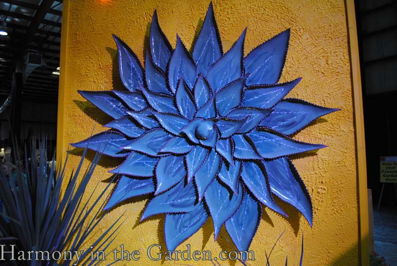
I love the vibrant ceramic flower (above, created by Jim Sudal) and the shadows it cast on the wall, helping to give it a three-dimensional effect.

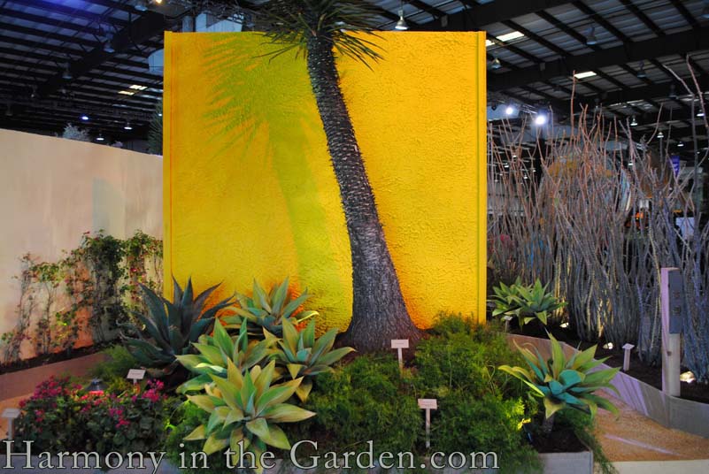
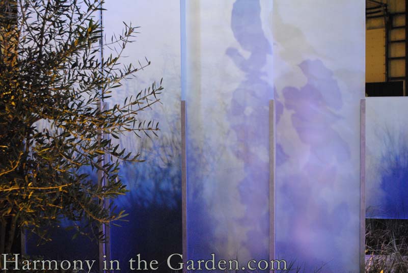
In fact, along with color,  shadows also seemed to be a significant theme throughout the gardens.  Highly structural plants were strategically placed near colorful walls and lights to let their shadows add a subtle dimension to the garden.

I can only imagine how breath-taking the palm tree’s shadow would look in a natural garden setting, just as the sun begins to set (without the distracting show lighting).  

I love how the students created such colorful and textural interest in this particularly narrow space.

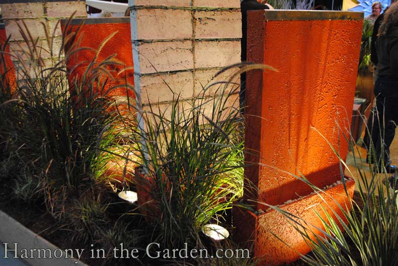
These dividers are actually made of Papercrete, a blend of concrete and re-pulped paper fiber that only weighs one third of a typical concrete wall. One student told me about an entire home he toured that was made of papercrete.  Very cool.‘Wonderland’, created by Arterra Landscape Architects, had some of the most creative use of color and shadows I’ve seen.

These concrete walls help to provide a sense of movement from the shadows of passing people as well as the shapes and forms of the nearby plants.

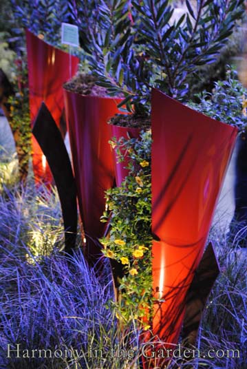
Aren’t these custom-made red ‘Furl’ steel planters positively divine?

If you have an extra $2500 burning a hole in your pocket, Arterra’s ‘Furl’ can be yours!  I love the opening down the side of the cone, allowing trailing plants to spill forth (there’s 1-inch screen that holds the plants and soil in place).

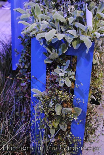
And the blue planters are perfect for creating a living wall down one side, with a traditional planting space at the top.

Okay, so now let’s shift gears.

It’s one thing to see these types of creations  in show gardens. and it’s another to see them implemented in actual gardens.  Which is why my visit to Sunset Magazine’s headquarters, in Menlo Park, was so inspiring.

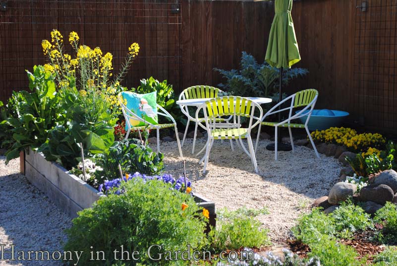
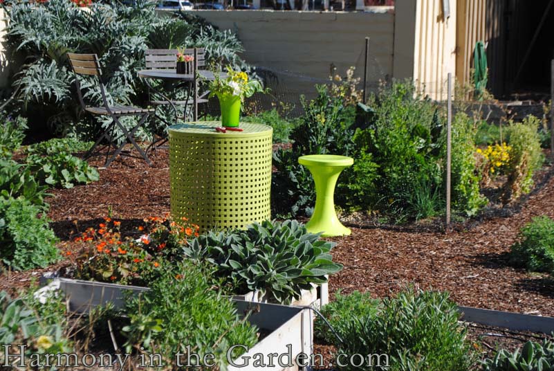
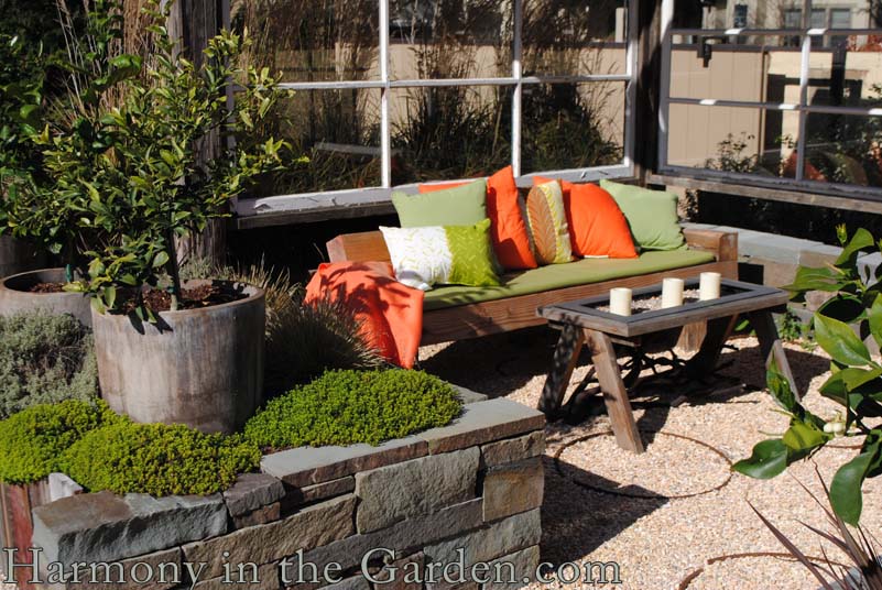
Here are a few outstanding examples of how to implement color in your own garden.Lime green is one of my favorite colors in the garden as it always conjures up images of fresh new growth – the epitome of spring.This is my favorite corner of the garden, designed by the talented father/daughter duo at McKenna Landscapes.

Cushions are such an easy way to add an inexpensive burst of color to your patio.

Can you see the rebar circles imbedded in the crushed gravel?  Such a simple, yet creative, way to add an unexpected element to a gravel patio or pathway.

And I love the containers set within the raised planter.  A great way to add a little extra vertical interest to a small space. 

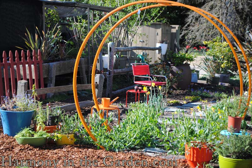
I SO want one of these circular arbors for my own garden.  I’d plant little cherry tomatoes on either side and train them to grow up and over so their little red fruits might gracefully dangle like flashy earrings – yum!

Created by TerraTrellis (a two-woman design team in Los Angeles) this powder-coated steel trellis comes in scads of delicious colors.  I’m always a fan of useful structures that make a statement even when completely bare as they add much needed winter interest to a sleeping garden.

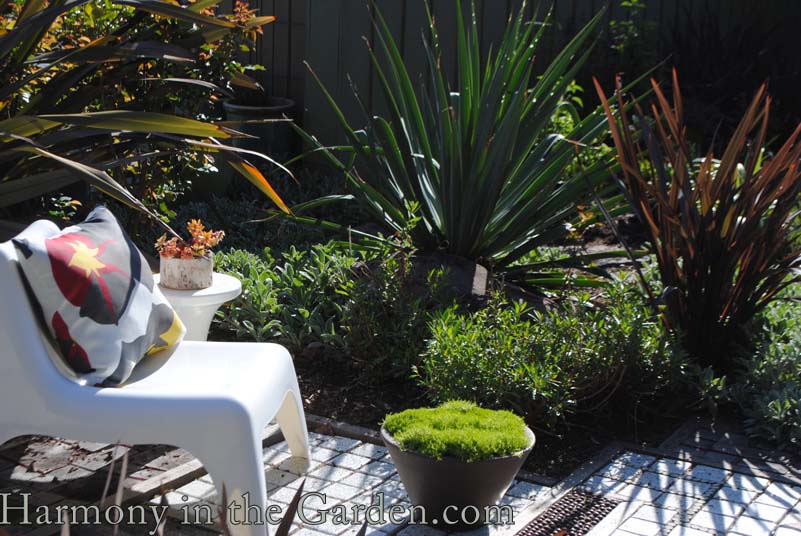
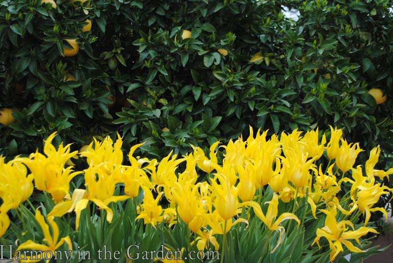
And if bright colors aren’t quite your thing, maybe you’ll appreciate the crisp white lines of this contemporary chair?  Combined with a colorful pillow, it adds a chic look to any patio setting.West Point TulipsOkay, I  couldn’t bring myself to write an entire post and not include a single plant – so here it is:

Sunset’s fabulous combination of ‘West Point’ tulips that perfectly echo the yellow grapefruits behind them.

To me, this is the epitome of spring!


Enjoyed this article?  Please share it with others: 

Please leave a comment below

23 Comments

  • Wow. The electric blue is really stunning! I have to admit that I’m always drawn to that color when I’m looking at planters. It really makes a statement in the garden because it is often such a major contrast. Thanks for all the photos. They give me the inspiration to consider other ways of bringing a pop of color in the garden!

    Reply
    • You’re so welcome, Becky. I’m glad you enjoyed the photos and inspiration these gardens had to offer!!

      Reply
  • Thanks for sharing your tours. I covet that circular trellis but the price made me wince so I guess I’ll stick to buying myself some new pillows to snap up the color quotient in my garden.

    Reply
    • Yeah – unfortunately it’s a little on the pricey end. But it sure is gorgeous!! It’s actually featured in the current edition of Sunset, dripping with Scarlet Runner Beans. A lovely sight to behold!

      Reply
      • I love the circular trellis too! I’ve just purchased a pack of Scarlet Runner Beans to grow up my obelisk. The seeds are from the D. Landreth Company. Have to admit I was first taken by the packaging by the Company and then interested to find that they are the oldest seed company, so I picked the runner beans to grow – all this thought process in front of the seed kiosk! ANd now your great idea seals it! Runner beans will hopefully run up the obelisk!

        Reply
        • Wonderful, Jayne! It sounds like your obelisk will be gorgeous, just dripping with the beautiful scarlet flowers and beans! I haven’t grown them for many, many years, but all this talk about them is making me want to rush out to the nursery to find a pack. I remember the color of the flower was such a lovely, pure red. Thanks for the inspiration!!

          Reply
  • I loved your photos and the use of color. I didn’t get to come to the San Francisco Flower show this year; I had looked at the online program, and I believe that you were giving a talk on using color in the garden. Will you please write in your blog about using color and how to use a color wheel in the garden? Thanks!

    Reply
    • Oh I’m so sorry I missed you at the show, Debbie! I’ve been writing about color a lot (for my book that’s coming out in September as well as my presentation) so it’s definitely on my brain these days! I’ll definitely be writing about that very topic in the upcoming months as I’ve found some really great ways to help people understand how to actually USE that sometimes-intimidating color wheel to help solve many common garden problems.

      Reply
  • West Point tulips! We planted some for the first time last fall. Now I really can’t wait to see them!

    Reply
    • Lucky you, Jason! These tulips were truly some of the prettiest I’ve ever seen – I just love their wavy petals!

      Reply
  • Wonderful photos and insights as usual, Rebecca! One combo I love is a royal blue pot with chartreuse-leaved plants, like good old Sedum angelina, and maybe something orange for the upright element (like Euphorbia tirucalli ‘Sticks on Fire’). But what doesn’t work is to combine the dusky blues so typical of succulents with bright blue. Would you agree that the intensity of the colors need to be equal? Does it ever work to combine pastels with brights?

    Reply
    • Hi Debra – thanks for your compliments! I’ve been thinking about your questions (perfect timing, by the way, since today I’m editing that very chapter in my forthcoming book!) and I’m not quite sure I agree that the intensity of the colors need to be equal. If we’re talking about the shades (ie: intensity – brightest to lightest) those are actually the most important qualities to understand when creating a monochromatic garden. A successful all-red border (or container) for example, doesn’t use just one shade of red (e.g. bright) but contains multiple shades, ranging from the lightest and softest all the way down to the deepest and darkest. But you make a really good point about the dusky blues of many succulents. In fact, just yesterday I was trying to photograph a combination in my garden of blue fescue, hens n’ chicks and the blue glass balls that Barbara Sanderson gave me, and in every photos the brightest blue ball steals the show. So I guess what I’m saying is now you’re making me re-think everything!! ha!

      Reply
  • You made me want to tour the Sunset gardens. I hope they are open to the public. Thanks for sharing the photos.

    I love lime green too, I keep sneaking this color among my plants. I just found a lime green japanese grass that will look great in my shade garden. I love lime green and maroon together, so I am trying to design my garden with euphorbia and black aeonium in many spots.

    I am still thinking of paying you a visit, I will send you a message.

    Reply
    • Oh Laura – you absolutely must tour their garden! Here’s some info from their site: The gardens are open for self-guided walking tours from 9 a.m. to 4 p.m. Mondays through Fridays (except holidays and the week before Celebration Weekend in early June) at 80 Willow Road, Menlo Park, CA. Groups of 10 or more should phone ahead for reservations. For more information, please call (650) 321-3600 from 8 a.m. to 4 p.m. And yes, definitely let me know when you’d like to visit my own garden. I, too, am a huge fan of maroon and chartreuse!

      Reply
  • It may snow yet again in CT this week, so a pop of color in my garden is just what I need. Funny, I’ve been thinking of creating a whimsical garden this year – maybe I’m just antsy for color. These pix have already given me some good ideas.

    Reply
  • Rebecca, these photos are making me long to visit California. It looks so warm and bright as I sit here in two inches of slush on the East Coast. Thanks for sharing these!

    Reply
    • I keep reading about the never-ending winter you’re having back there, Mary and Rosemary – I’m so sorry! I can only imagine how antsy you must be feeling. Enough of the snow already!!!!! While we’re having an early spring here in California, we’ll be paying the price soon. We’ve had so little rainfall that water rationing is already on most people’s minds. But for now, I’ll just go back outside and take a deep whiff of the jasmine that’s beginning to bloom and pray for rain. Here’s hoping spring makes a speedy entrance for you!!!

      Reply
  • Love this post!!! I have 2 art walls in my garden…one is purple and the other a golden yellow. They add such color and fun, all year round. My very talented designer, Darryl Furuya at Landscape Nirvana, gets all the credit for them!

    Reply
    • Purple and golden yellow? They sound lovely, Carol – two of my favorite colors. I’m heading over to try and find Darryl Furuya’s website right now to see what else he’s designed….

      Reply
      • Rebecca – I’m here in Los Altos….let me know if you’d like to pop by for an in -person peek!

        Reply
        • Oh, I’d love to Carol! I’ll have some free time after spring break (mid-April) – I have your email here and will definitely contact you!!

          Reply
  • Your photos are so amazing. I can’t image the last time I had $2,500 burning a hole in my pocket, but I do like using the ideas in combination with the materials at the local recycle store. I am looking for more arbor inspirations. The circular hoops have given me some interesting ideas.

    Reply
    • We should all be so lucky to have that kind of money sitting around, right? But you’re right – they’re fantastic ideas to help ignite the inspirational fire in all of us. Can’t wait to see what arbor creations you come up with – please share them!

      Reply

Leave a Reply

Your email address will not be published. Required fields are marked *