I must have walked around this show for hours, snapping photos of all the gardens because when I came home I had close to 800 pictures! One thing I noticed was that I tend to take pictures of small portions of the gardens which really caught my eye. I rarely have a photo of the entire garden. It must be how I see things, one segment at a time. Sometimes it’s the small details of a garden which, taken as a whole, really add that ‘WOW’ factor.
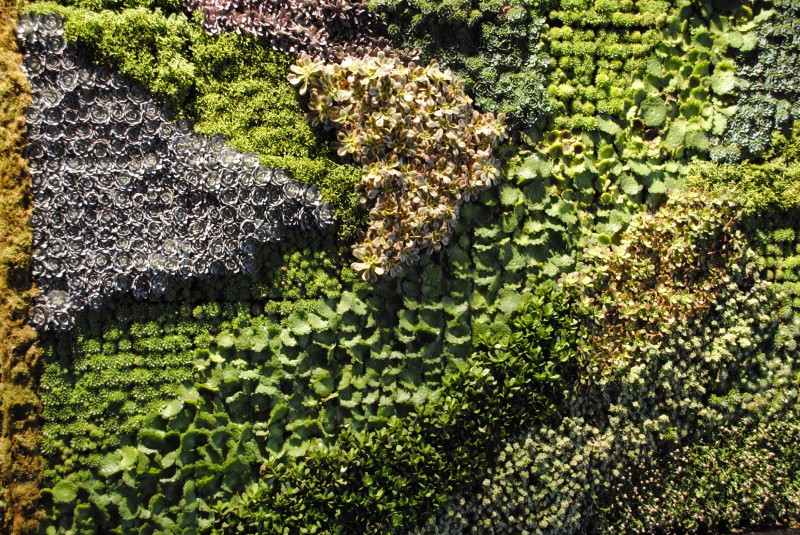
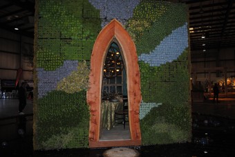
Take this succulent wall, for example, created by Organic Mechanics. Many of you have already seen photos circulating of this stunning example of a living cube. It was quite spectacular. But when you focus on just a portion of one of the walls (like in the photo above) you begin to notice the beautiful play of colors, textures, and shapes.![]()
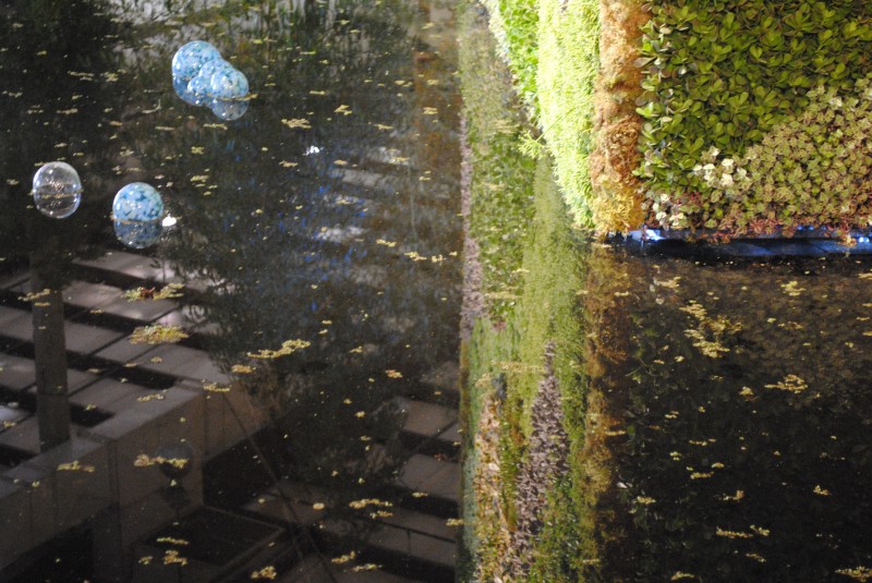
I think my favorite image of ‘The Cube’ was its actual reflection in the moat that surrounded it.
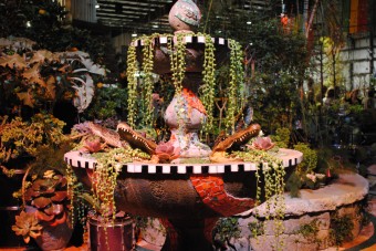
Another favorite was the Alligator Fountain, created by Dawn Engel. Definitely the most amazing and creative fountain I’ve ever seen. People were mobbing this garden, snapping pictures right and left.![]()
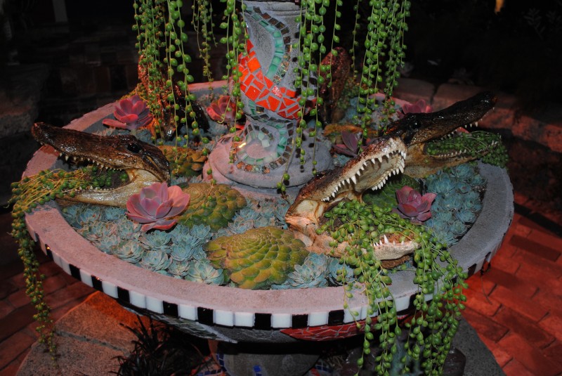
But my favorite image is this close-up, where you can really see how the blue succulents are used to imitate water and others are used to imitate lily pads.
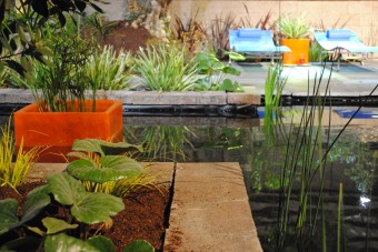
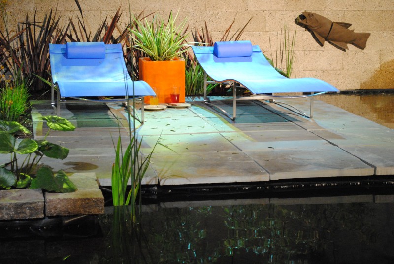
I also really liked the crisp, clean lines of this garden, along with the bright colors of the lounge chairs and pots.![]()
But upon closer inspection you notice that the fish sculptures on the wall make it look as if they’re jumping over the chaise lounges.
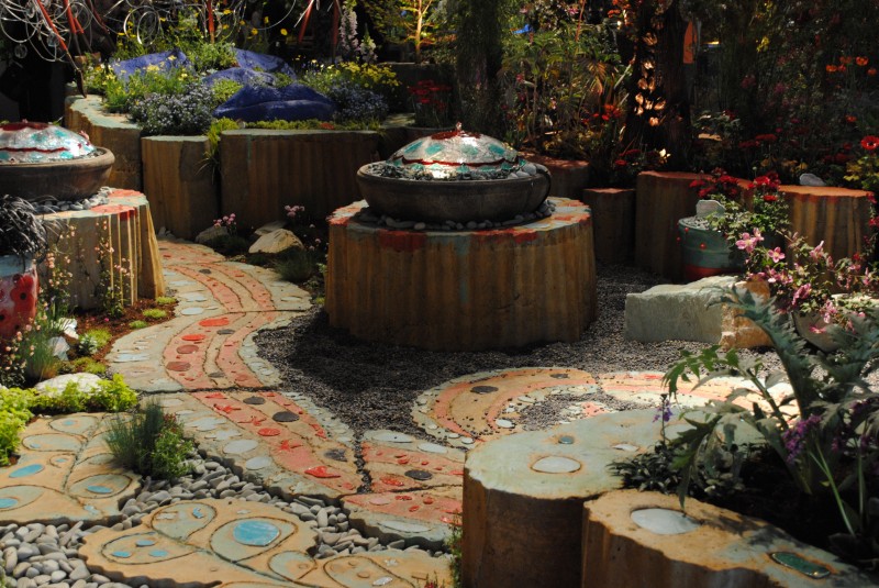
This garden, created by Keeyla Meadows, generated a lot of buzz – some loved it, but some seemed confused and were a bit overwhelmed by all the art, elements, plants and color.![]()
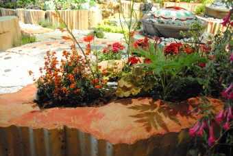
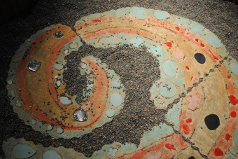
But when I stepped back and focused on small areas at a time, I could really notice the beautiful use of color in the materials used, and I began to really appreciate this garden.
To really appreciate all the hard work these artists put into these displays, a person really needs to make sure they dedicate a decent portion of time to each one, focusing on the details and not just the whole.![]()
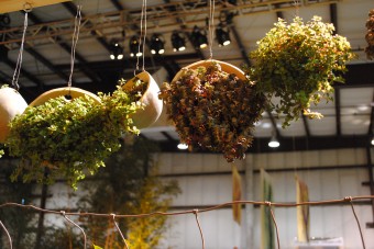
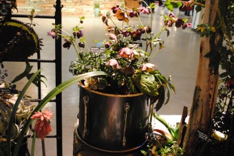
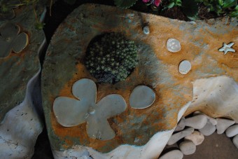
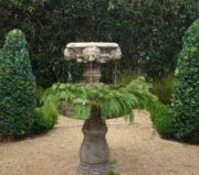
Here are a few more random photographs which I found particularly intriguing. Enjoy!
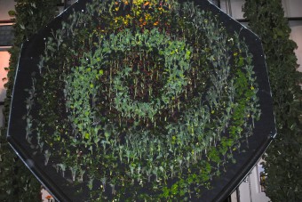
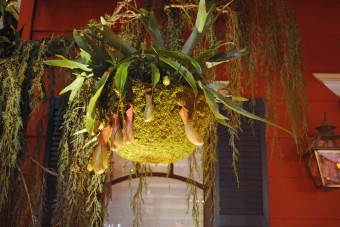
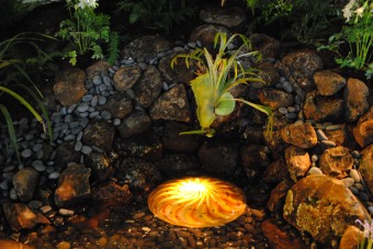
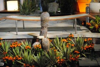





9 Comments
Great eye Rebecca. Thanks for the nice bit of education for us rookies on how to better appreciate the artistry of these amazing gardens.
Amazing photos! I had so much trouble, seemed like the lighting was not conducive to even an acceptable photo, and yours are so beautiful! Thanks!
Rebecca, Great post that makes me want to go back one more time and look at the details. Lucky we have your photos and commentary since the show is all gone. More, please!
That’s a great reflective shot of the cube! The Creole Courtyard was my favorite over-all. That fountain was fantastic 🙂
Nice post Rebecca, I’m the same way! For one thing, without a good camera and a tripod, the gardens are difficult to photograph in their entirety anyway (we took care of that for you!) Those pictures will show the larger view, but won’t necessarily catch all the brilliant details you did. Thanks so much for sharing!
Of course you appreciate the details. It’s obvious when you visit your garden that they’re very important to you! Every one is perfect… Thanks for a zoomed in view of the show. I was so sorry to miss it!
It’s nice to know I’m in good company….I find myself also focusing in the details, often without getting a single image of the overall garden/plant.
I really enjoyed these images, thank you!
This is great! I’m one of the folks that rush through and take pictures of the overall garden. I missed most of the details you have here, like the succulent fountain and the naughty cactus.
I admire people/photographers who take the time to look at the details. I wish I could!